Lauren Carter, Indie Developer: ‘Getting into the Industry’
Lauren was a an Indie game developer, but she hasn’t always been and wanted to be one. Lauren’s journey to get into the industry was far from being straight forward, as she had many different jobs before finding her talent of narrative play. She included that she didn’t even get brought up around games or were ever good at them showing that you don’t need to a stereo-typical hardcore gamer to be apart of the industry. Lauren also discussed the difference of being in a indie studio and AAA studio. Being in a indie team of studio, you get more of the say in the production of the game as well as being more apart of it . Whereas if you were working with a big AAA team, your contributions would be minuscule. Lauren enjoys working in small groups as they effectively need to work more as a combined team to fix the problems together. The information and thoughts I gained from this lecture were that not everyone has a set plan and knows exactly what they want to do has they haven’t found that passion yet. It is beneficial to have more of a path you want to go down, but you don’t always have to stay there, follow whatever you are passionate about and enjoy.
Alistair Aitcheson and the Incredible Playable Show-
When I think of games I almost always link it to being behind a screen and is electronic or digital. Alistair’s approach with games shatters that image in my head as he uses physical and human interaction to create his ideas from. Using human interaction and engaging with the audience is Alistair’s soil, its the root of his successful games so why change it. I found his creativity admirable as his games were never too complex as he said he likes to use ‘soft skills’ meaning near everyone would be able to follow the game and understand what is going on. Although adding ‘soft skills’ into games could be tedious, they could also work as the most effective to help the game. One point that Alistair said in the lecture was how the same game will always play out different, as the audience will always change causing all kinds of different events to occur. I found this quite fascinating as the game stays the same, but the outcome of the play-through can always be different due to the interaction with the audience element. One game that look enjoyable was Dash and Bash where you would have a colour assigned to you, then having to press the button for what ever screen you see your colour show up on. He talked about the play testing for this game, as he found that people enjoyed using there bodies to get in the way of their opponents much more when would could only use you their arms. This just goes back to the human interaction and having that sense of playfulness.
Lucy Kyriakidou on Freelancing as a 2D Game Artist-
In Lucy’s lecture she talked about her journey as a 2D game artist, and what things she has learnt in the industry. She expressed how important it is to talk to people in or around the game industry as it could and most likely will help you in the future. She mentioned how she’s working on a game at the moment that got introduced by a friend she used to work in a studio with. So, knowing a range of people and being friendly can get you far in the gaming industry. As well as being a freelancer in 2D, she had also worked in studios in the past, but did not have pleasant memories of them. This was down to management through the company as the employees did not get given the information or direction they needed for, for the clients. The employees had too much freedom (which isn’t always a good thing she added) as they were not getting managed correctly, which can be bad for the company. She went on to talk about most 2D freelancers, their journeys are not always as straight forward and as easy as they would like but it does become like that sometimes. Coming back and reflecting from the lecture, it has taught me to be more interactive with the industry, and just start talking to people. I am definitely going to try to attend more gaming events so I can get to know people and step my foot into the industry.
Kristrun Fridriksdottir from Sports Interactive: The Role of a Technical Artist-
Kristrun plays the role of a technical artist for the company, Sports Interactive. Being a TA underlines bits from all areas such as 3D modelling, coding, animation and various others. A TA basically solves the technical problems throughout the process of making the games. A TA needs to know a lot information about the fundamentals about making assets, character animations, blueprinting etc. Knowing these allows them to be able to solve various problems, or create tools to help fix them. Kristrun went on to talk about the company she works for which is Sports Interactive. The work environment there sounded really pleasant and is how I would like to work in a studio. They seem like a really social and creative company, which is probably why 40% of the employees have been there for over ten years. I feel being a TA wouldn’t be the best role for me personally, as it would be very difficult learning all those different areas. I however do want to branch my skills out as an artist and not have one specific field I specialist in hopefully making me more employable. The areas I would like know lean more to the creative other than technical side such as being a concept designer, environmental artist, character artist, 3D modeller etc.
Presentation Slides- Pre work
These are some of the notes I have created before heading to our group meetings, so my team could get an idea of what I would be talking about hopefully linking it to their work and reference back to the question.
Pre-Digital (2600B.C.E-1962)
[Pick-up Sticks (1800s)] – [TM]
The object of the game is to pick up as many sticks as you can, and whoever has the most at the end is the winner. To begin the game, a bundle of sticks are randomly placed so that they end up tangled in a pile. The more tangled the better, as it will make it a more challenging game. In some versions of the game, any isolated sticks, or sticks lying alone, are removed.
Simple games like Pick-up sticks can always lead to inspiration for future games .e.g. Jenga is quite a similar game in the fact that you have to collect the blocks without allowing the tower to fall over. The fundamentals of Jenga could have been inspired by Pick-up sticks.
The interesting features about this game is that the tangled pile of sticks will never be the same, allowing each game to be different. Because the sticks will always be randomly placed, it means that the difficulty will constantly be changing where some games will be harder or easier than others to collect the sticks.
Arcade (1962-1986)
[Crazy Balloon (1980)] – [TM]
The player controls a box tied to a floating balloon, which swings left and right continually, within a maze filled with spikes. If the balloon or box has any contact with the spikes, the balloon will pop causing the player to lose a life. Using a four-way joystick, the player moves the box through the maze and toward the goal, hopefully keeping the swinging balloon away from the spikes.
This game hasn’t has a big influence to the history of games, but it does symbolise just one of the many small enjoyable games in the arcade era. However is does have fundamentals that we see in games today, such as having start and finish points and have progressive levels that require more skill.
Most of the features in the game have been implemented into it to make it more challenging for the player e.g. moving spikes start to appear when you start to progress through the stages of the game. Another feature was making the level start to shake and move causing the player to think carefully apart their next steps. Again this feature is added to further the difficulty, making it harder for the player to complete the level.
Console (1986-2007)
[Halo 2 (2004)] – [TM]
Halo 2 is a first-person shooter game developed by Bungie. Like all the other Halos it was released for the Xboxgame console on November 9, 2004. The game is the second instalment in the Halo franchise and the sequel to 2001’s Halo: Combat Evolved. Like Halo: Combat Evolved, the Xbox version of Halo 2 has a multiplayer system that allows players to compete with each other in split-screen or online in the multiplayer type using Xbox Live.
On release, Halo 2 was the most popular video game on Xbox Live and was getting played by millions of players. 2 years later by 2006, more than 500 million games of Halo 2 had been played and more than 710 million hours had been spent playing it. The main attraction to Halo 2 was the multiplayer, competing against other players creating skill gaps of who has the better shot. Halo 2 has had a huge impact to gaming today, as esports blew up around the competitiveness of Halo 2, that there even events to compete in solos or teams.
Halo 2 was the first Halo to introduce the three bullet, burst, battle rifle. The battle rifle took over the assault rifle from Halo CE as the main gun for Master Chief and the players. Halo 2 also allowed you to play as the Arbiter with the Covenant, the force that Master Chief is set to destroy.
Contemporary (2007-Present)
[Halo Wars 2009] – [TM]
Halo Wars is a real-time strategy video game developed by Ensemble Studios and published by Microsoft Game Studios. It was created only for the Xbox 360 console as it was an exclusive and a Microsoft-owned property. Like most games Halo Wars features a story-based, campaign game mode that can be played alone or cooperatively online over servers to Xbox live. Another addition in Halo Wars is a plot-less mode called “skirmish”. This is essentially the main multiplayer mode where you can face opponents or play with friends in different game types (1v1, 2v2, 3v3).
This was the first Halo game to be expanded in the franchise from a first person shooter, and still got a lot of good feedback from the community. The feedback and sales were good enough for them to create a Halo Wars 2. This can show that companies can branch off and experiment with their games as long as they are gaining positive feedback from the community.
Some features that are added into Halo Wars are the elements of each unit having a strength and weakness. This allows you to outwit your opponent and have the stronger army of units.e.g. vehicles > infantry, vehicles < air, infantry > air. You can also level up units in their specific building types after enough resources have been collected from the built supply pads.
As the image is based at night time there inst a major light source such as the sun, but there is the light from a fire. The light from the fire would work completely different as its placed on the ground, creating a limited amount of shadows. This happens because the light it not bright nor powerful enough to reach long distances, as it you would soon fade away the further it got. Because the light source is a fire this does mean there would be a warm, vibrant mist around it as there isn’t another light source to compete.
Image 2
This image includes tones of light and shadows as the source is from outside peaking through the architecture. Because the architecture includes pillars, and large glass windows this would create vase amounts of light being bounced around and reflected of the different angles. The shadows would only appear if the light cant get to it, this is why the sides of the pillars and other objects facing away from the light source are much darker compared to the areas that the sun can see.
Task 2- Composition
Image 1
Looking at the image my eyes straight away got drawn to the castle as it was the brightest element on the canvas. You have a darker foreground that includes the character creating the contrast of dark’s against lights. As the foreground is dark this suggests the character is further up than the lower land, being shadowed by a mountain or some near forest. The lighting and vegetation indicates that it would be a warm summers day with the use of light greens.
Image 2
I feel that the main vocal point is the village as that’s where my eye gets drawn too. The artist has done this by including a red fog/mist in the heart of the village to attract the viewers eye. Another technique the artist has included is the use of shadows from the stairs at the front, they are fading to the vanishing point, which is the village. You can see this technique even being used for the branch as well as the tip of the building in the right foreground. The dark, muted colours in the image have been used to set the tone of a cold misty night.With the amount of light glazing from the sky this could also infer that its a full moon. Looking at this image it makes me think that somethings bad about to happen or its a big night of celebration of some sort, it tells a story.
Task 3- Colour theory
Image 1
Straight away I can see a few complementary hues in the image as there is yellow with blue, orange with azure, and some red with cyan. In this image there is a lot happening involving the hues and feel the artist has done this simply for the work to jump and stand out to the viewer. I do however really like this image, mainly for the use of such a strong colour palette, I feel it gives the image a more vibrant feel indicating its a warm sunny summers day.
Image 2
In this image I would say the more dominant colours are cyan against the reds/oranges. These colours are complementary hues that have been used to outline the river streams, following up to the lit path. I think the artist has balanced the colours as I feel the composition is split up nicely through using the contrasting hues.
Image 3
In this image you can tell that only a few colours have been used which are all simultaneous hues on the the colour wheel. The more dominant colour is the red followed by orange and rose. Overall the image gives of a warm feel to it by using vibrant, saturated hues.
Wednesday Lectures
Beginning theory-
The grid shows that I mostly prefer games that are competitive and is mostly based on skill. For example Halo 3 is a first person shooter and was one of the few games that started competitive game play and help e-sports to become so popular to this day. Although Halo 3 was largely popular with the campaign, multiplayer was the main focus as it was one of the few competitive games, which players liked to play and increase there skill. Players will always have the urge to out do their opponents and that comes down to normal human genetics and thoughts as we don’t like to be seen as the weaker, less intelligent opponent. The same analogy can be involve with Call of Duty: BO2. BO2 is another heavily based multiplayer game, where players will be constantly trying to show there worth and potential, as so our the other opponents. But sometimes the best player or opponent becomes the victor, in some cases the game could fall into the alea category where one player may have already been damage causing the next opponent to to have the full advantage. Fortnite also could fall into the alea category, as when you drop from the battle bus it comes down to chance of what weapons are in the building that you’ve chose, again this doesn’t necessarily mean the opponent it better but they just manged to find a better gun to help their advantage. The other games I chose were Borderlands 2 and Ark survival as these were my favourite open world-role playing games. These games main focus is evolution and working yourself up, learning and collecting different elements e.g. weapons, gear etc.
‘Ways of Seeing’ by John Berger
Episode 1-
The paintings images are silent and still, its like no other e.g. a book moves but a painting is unique
Its easy to manipulate a painting using movement so it could change the idea and story of the painting completely
An images surroundings can change its meaning
Music and rhythm can change the significance of a painting dramatically
Episode 2-
Women are painted as objects in nude paintings
Paintings can often symbolise that the women is available
Episode 3-
Painting can either be bought or owned
The poor had neither annals nor portraits , their lives are unrecorded
Clothes indicated social status
Episode 4-
Women’s bodies and sexuality are used to sell products
Character-
What does the game need the character to do?
Does the character design show any inter textual influences?
Do the aesthetic qualities of the character fulfil both game needs and provide a meaningful player experience?
My selected character is Master chief. Master chief has a huge background story that has continued from the early Halos and most likely will continue in the future ones. Master Chief gets used as weapon defending planet earth from dangers such as the Covenant and the flood. In Halo 2 and 3 the game relies on Master Chief to be the hero as the audience and players see him as an indestructible character. Master Chief has became a well known character in the gaming community as its where most gamers have come from hence them having strong connections. Master Chief isn’t just some normal soldier hes a specific character designed for this game to be immersed and loved by the audience, through his emotionless and calm behaviour. The overall character physcially and aesthetically comes down to his famous body armour suit along with his helmet. The armour usually does change very slightly when a new halo comes at Master Chief has a unique style that cant be tarnished.
Monday– Brief. Starting the second week of University we got we told our brief for task 1. Task 1 would carry out for the next 2 weeks, then we would get introduced to task 2 for the next 2 weeks after etc. The brief consisted of creating a container, “A hollow object, such as a box or a bottle, that can be used for holding something, especially to carry or store it.” But we would start off the concept art process through silhouettes, which was a new method to me so I was a bit sceptical. Going away from the briefing lecture, one game was stuck in my head for mapping ideas which was the Borderlands collection. Borderlands is an open world game that allows you to travel through various maps collecting weapons, ammo, perks, lethal grenades all through containers and vending machines. The styles of the containers are so unique and different yet are so recognisable that they contain a specific object. So that is the effect I would like to take into account with my container ideas for the silhouette process.
Tuesday- Cubes, perspective, black rectangles, start of silhouettes. The following day in the workshop we did a quick recap of the brief and what is required for task 1. Then the lesson started off with perspective drawings of cubes. Although it was with basic cube shapes, I found it useful as my perspective could always be improved, especially now using lines and a vanishing point. I feel having a good perspective on drawings and ideas is important if you want to make them look more realistic and believable, something I would like to implement into my ideas. The second half of the workshop consisted of cutting into block rectangles using the erase tool to create a series of silhouettes. I felt that the shapes and silhouettes that I didn’t put much thought into usually came out the most successful or would at least help me branch off more and improved ideas. The aim of this process was to keep the silhouettes quick and simple so I would have a wide range of ideas to work from for the iteration.
Wednesday- Silhouettes. Carrying on from the workshop, I continued to create various other silhouette shapes for my container. I did feel like most of them were looking quite similar to each other, so I decided to look around my room for inspiration. I had a variety of different plastic/water bottles and other containers such as energy drinks and protein shakes. The elements I were looking at were the shape and lids of the containers which I could manipulate into my silhouettes.
Thursday- I started to look for some influences to try and help broaden my ideas and imagination. I made a separate mood board for containers that could possibly contain/store a liquid of some sort e.g. potion bottles, vase jugs. One type of container that came to mind when browsing was lethal grenades. I think grenades or tactical equipment could be an interesting object to iterate further into the process.
My second mood board consisted of in game containers such as weapon/ammo boxes. For my iterations I would like to experiment with a variety of different containers e.g. weapons box, bottles, grenades etc as i want to have a wide range to choose from.
Friday- introduced to Maya, 3D chest container, light, basic shapes. On Friday we can had a 3D lesson using the program Maya. 3D is a weaker point of mine as I haven’t had much experience other than a few lessons on blender in college, so I didn’t have high expectations of the work I would produce. Because it was our first Maya lessons, we got taught the basic controls on how to move the view point around the space, as well as the tool bar on the left-hand side. The tools on the side help scale, rotate and move the selected object in the program. As task 1 was related to containers the lesson consisted of creating a simple 3D container using basic shapes e.g. cubes, cylinders etc. The container that we got shown how to make was a chest, it took a little be longer to create as I was still getting use to the controls and lining up the shapes. Once we had a chest to work off from, we started to add colour using select material and clicking Lambert to open up the colour selection. After choosing a colour we moved onto adding light to the scene to create shadows. There is a light bulb symbol on the top panel which allows you to bring in a light source into the environment. The light source will create shadows from your object in the environment that you can change using the rotate tool. Overall, I was quite happy with the container I created and did come away from that lesson with more confident in 3D.
The weekend – I decided to create another silhouette sheet as I felt I sparked a few ideas from creating the mood boards which I could potentially use for the iteration process.
After creating the last silhouette sheet I gave myself a bit of time to cycle through all of them and select which ones I thought stood out and had the most potential to take further.
Week 2 (1st – 7th October)
Monday- Starting the week I made sure I had my selected silhouettes ready to move onto iteration. The method I used to select my silhouettes was which ones made ideas rush into my head from just looking them for a brief moment, and what ones actually made me excited to start iterating. I believe with any creative practise that if you are passionate or excited about an idea or thought, that’s when your best work will show.
Tuesday+Wednesday – The technique we got taught for the iteration process was the use of grey scale, a technique I’ve never really experimented with. I did however find it very useful as it allows you to only use different shades of grey making it a much quicker process then messing around with colour.
The first set of iterations I thought came out quite nice as i didn’t want them too complicated or too simple. The top silhouette resembled mostly an ammo box to me, so that’s what I decided to go for with the first two. I tested out different scales such a stretching the first one and rounding off the second one but keeping it similar to the square shape. My third idea was to round the edges off completely creating some sort of lethal grenade influenced from my mood board. In my fourth idea I tried to experiment in creating a back-pack, but wasn’t too keen with the outcome.
With my second set of iterations I kept with the same type of container throughout (vase/Jug), but started to include some patterns and markings to give them more character. The first two I stuck roughly to the silhouette, whereas the other two I modified and included handles to give them a more unique shape.
After the first set of iterations I was starting to get used to the grey scale technique and became more confident on how to use it. I Felt including the strong dark greys against the light greys really helped give the containers a 3D look especially with the glass bottles. These were my more favoured ideas as I thought they were more interesting overall, as well as the improved artwork.
Thursday- When I completed my iterations I soon moved onto the final stage of task 1, which was the model sheet. I did however alter the idea before the process of the model sheet as I decided to include a snakes head which could be used as the bottle cap. I really liked this idea as i thought it gave the container more value and a new level of uniqueness i didn’t see with the other iterations. I didn’t use a wide colour scheme, as I thought it wasn’t necessary. As the container is holding a liquid I decided to colour it red to symbolise blood, or a poison of some sort to link it with the snake wrapped around the bottle.
Friday- I was looking forward to the life drawing session as I find the human anatomy really interesting, especially coming from a background of doing animation I enjoy drawing quick sketches of the muscle groups. We started off by drawing quick sketches that took roughly 5 mins switching poses. I find this method of drawing/sketching much more useful as you have less time to think, and is a skill that I would like to improve to help me develop as an artist. We soon increased the time limit on the sketches but still focused on the shape and the pose that was being modelled. The time limit then switched to a 1-hour period where we focused on the shape as well as the detail. I struggled with this part of the session as feel drawing human features to make look realistic is not my strongest element of drawing as I have much to improve on.
Bridges
Week 3 (8th – 14th October)
Monday-Task 2 bridges. As the first 2 weeks have finished, starting the week we got told we will be moving on to task 2 which will be designing and creating bridges. I was excited about this task as we would be able to implement bridges into environments which is my favourite area of concept art. Same as the last brief its fairly wide open to ideas as long as they follow the description of what creates a bridge.“A bridge is a structure that is built over a railway, river, or road so that people or vehicles can cross from one side to the other.”“Something that bridges the gap between two very different things has some of the qualities of each of these things.” I feel I can be more imaginative and creative in this task as you can include a variety of angles to really help make your bridge designs jump out and tell a story to the viewer.
Tuesday- Repeating the same process as Task 1, we jumped into creating bridge silhouettes. I found it quite difficult at the start to create silhouettes from scratch as i wasn’t putting much thought into it. Although the silhouette process should be quick and easy, I struggled with the perspective side of my bridges as I couldn’t quite execute the illusion of the bridge fading into the distance.
I find mood boards really helpful when trying to generate ideas, because you can take elements from others and combine them with your own. Mood boards also help me a lot to spark ideas I wouldn’t normally come up with by myself as I can see it from a different perspective.
Wednesday- Carrying on with the silhouettes I had a much better understanding of bridges due to the influence of the mood boards e.g. How bridges get put into environments+ not all bridges have to be man made. With this kept in mind, I started to experiment and really expand my ideas.
I feel after having some inspiration my ideas became so much better as I started to use different angles, different environments, different styles a much larger variety of ideas.
Thursday-I found it quite hard to choose my selected silhouettes as there wasn’t many that I disliked, but I ended up choosing these four as I though these were the most unique as well as being very different from one another.
Week 4 (15th – 21st October)
Monday+Tuesday- For my first iteration I had a set idea of a floating city or a tall city that reaches the clouds that would have four separate bridges. Although I do like the iterated ones I still believe the original is the best one in my opinion as I feel it represents and suits the floating city idea.
This bridge design was one of my favourites as it looks so odd and peculiar, completely different to what bridges normally look like. I also really like the environment around it, I imagine it being high up on the edge of a waterfall.
I chose to iterate this idea as I liked the curve/bend, I thought it gave the bridge a different perspective, as you could let it curve out into the distance. The top right iteration was by far my favourite as I started to turn it into a more Sci-Fi style. I did this by adding glass panels onto the sides where the news/programs could get broadcasted on as people walk/drive across.
The reason for choosing this bridge to iterate was mainly for the angle and perspective. I think the angle just brings the whole piece together and works really well with the castle in the distance. Using a good angle like this gave me a chance to play around with the environments as well and allowed me to see what works and what doesn’t.
Wednesday- When I completed the iteration process I then had to choose one for my final. I liked all of them differently, they all had their own specific elements so I found it really hard to choose. I did however come up with a solution by creating rough thumbnails, and actually place the bridge in a surrounding environment.
I created the thumbnails and was able to see what the bridges would look like in an environment. I found this very useful as it did help me decide which bridge I wanted to take further as well as having a possible plan for my in-situ.
Thursday- The next step was to create a model sheet for my selected bridge. The same rules apply from creating the container model sheet, everything has to be to the same proportion. I wasn’t overly happy with the outcomes , although they all were to scale I felt the drawings could have been slightly better. But i do feel my drawings don’t always look the best when I mix squares and rectangles together as it looks really 2D or looks like its been built in Minecraft.
Friday- Maya, creating bridge in an environment, still using basic shapes, lighting, shadows. In our second 3D lesson we continued using the program Maya, and again worked to brief in this case task 2 to create a bridge in an environment. Using the same method as last session we kept to the basic tools and shapes to try not over complicate the piece. I did however experiment more by over stretching and completely resizing the shapes to add more depth to the piece and try to look less ‘blocky’. I found creating the bridge fairly simple as I could mostly use the duplicate tool throughout the process which was ctrl+d. Although it’s not a bridge that can help you get from a to b, my idea was to create a small pond or lake as the environment. This soon led to add some vegetation such as bushes and trees that I created from stretching the sphere and cylinder shape. After my second lesson using Maya, I feel I know the structure of the program much better and feel I can work at a much faster pace for future projects.
The Weekend- As I completed the model sheet, the next thing on the list was to create and plan you in-situ piece through thumbnails. Although I did have a good idea from creating the last thumbnails, I decided to create some more to have a wider selection to pick from. Thumbnails are suppose to be quick and rough, so I didn’t add too much detail or shading. The purpose of thumbnails is just to get your idea across. Overall i was happy with what I came up with however i still prefer the thumbnail I created earlier in the week.
Character
Week 5 (22nd – 28th October)
Monday- As the weeks have finished for bridges, we soon jumped straight into character design. We started of the week with our Monday lecture talking and going through the brief and what needs to be done in the upcoming weeks. We also got told that everyone would have a selected time period to work from as well as a few characters to choose from the story called Mercy and the Hunters of the Green Lake.
Tuesday- In the morning session I took some time to find out with time period I got (Persian Empire) and read through the story Mercy and the Hunters of the Green Lake a few times to decide which character would I like to create.
For the character I decided to go with the hunters, as I didn’t really think twice about it because i believe that is where my strongest work would come from. From the description of the hunters in the story I imagined them in my head being violet, nasty maybe even psychotic, as they would like to dance around the surface of the foggy lake. Appearance wise the first thoughts that came to mind were rough, dirty skin, soggy ripped clothes, and packed with weapons e.g. knifes, swords, axes, traps etc.
With those thoughts in mind I started creating my silhouettes. Instead of starting on Photoshop we got introduced to a programme called Alchemy. Alchemy is a good programme to use to create basic character shapes in a short amount of time. It did however take a few tries to get used too as the brushes would create the shapes for you. It was hard at first to let the brush have the control as sometimes it wouldn’t come out as you want it. But at the starting point its good to have shapes you wouldn’t normally make as it will help ideas grow off each other, ideas you would have never thought of before.
Wednesday+Thursday- As I got given Persian Empire for my time period I decided to watch a few documentaries. I found them really interesting and made me realise how big the Persian Empire was. The Persian Empire took over many different lands, keeping the people whos land it was and welcoming them into the Persian Empire. This method brought many different styles and religions from places such a Asia, Egypt, parts of Europe etc.
The videos gave me a much better understanding about the Persian Empire and how it was run, as well as the conditions they worked in.
One source that I thought would be good was the stone carvings in the walls and architecture, as it shows how all the peoples different clothing and styles.
Friday- Although I do find alchemy very useful, I did want another set of silhouettes done in Photoshop as I’d have much more control. I think that is quite important for this task as my silhouettes need to relate to the Persian Empire. The Persian Empire was massive covering over places such as Egypt, Syria etc, and because these countries were hot, the people of Persian would wear hats/head scarfs or thin clothing to protect them from the sun/heat. So in my silhouettes I included various different hats/scarfs as well a different types of robes. As I would be essentially designing a hunter, I including weapons for all of them. I think that the weapon could say a lot about the character for example, if they had a shield and a sword you would imagine they should be a quick, good fighter. Whereas if the character had an axe you would think of being more ruthless, and swinging to take a limb off. It just gives the character some more characteristics.
Week 6 (29th – 4th November)
Monday+Tuesday- After I felt I had enough silhouettes to chose on I continued to then next step, which was iteration.
For my first iteration I went with a more solider/sophisticated look, where they could be wearing more expensive clothing to let people know that they are the real thing. For the first and last character I added some textures on their faces to link with the description in the story, ‘some were gnarled like the bark of a dead tree’.
Iterating my second selected silhouette I got some inspiration from the monsters from Pirates of the Caribbean where they would have parts of the sea moulded into their skin and have rough textures. I tried to incorporate this into my designs, as the monsters in the story could possibly be partially aquatic.
In my third iteration I mainly messed around with the clothing with not really changing the overall design, except for the last one. I tried to add some armour to the character as well as keeping some traditional Persian clothing.
Wednesday+Thursday- The fourth set was one of my favourite iterations as I just liked the basic outline of the characters, with the proportions being some what acceptable. Whilst creating these iterations I read over the story again to spark any ideas and noticed it said some of the hunters were small and big. And with the other iterations I didn’t really take into account in changing the height. So in this iteration I decided to increase the height on one of them and lengthen his arms. After I designed that iteration I knew that it would be used as my final.
After i thought i had a few good designs from the iteration, I selected four of my favourite ones. These were what i believed my best designs and related the most to Persian Empire and a Hunter of green lake.
Carrying on with the iteration process, I started to iterated key parts that I thought were important. The first row was experimenting with different face scarfs playing around the lengths and how much percentage of the face it should take up. The second and third row I started to iterate with different hats, whatever the size or scale.
Friday- After I had iterated the top part of the character it was time to iterated from the body, shoulders down. Through iterating the clothes I started to think of back stories my character could have. One story that came to mind that my character could have leprosy ,as it was around in the Persian Empire time period. This caused him to be banished from the empire and locked up in the deep forests with other lepers. When some day he managed to escape the weighted chains and free the other lepers, for them to go round and seek revenge on animals and villagers hoping one day they will find the people that locked them up.
Leprosy – Leprosy has a rough texture and can include darker colours on the skin. This is how I shall texture my characters skin, using boils, cracks and wrinkles.
I wanted to create a weapons sheet just to see what ideas I could gather that my character could possibly use. But having in mind that I believe the weapon can give the character some characteristics, I wanted to stick with the hatchet as it makes my character relate to more a savage, or a dangerous hunter.
Week 7 (5th – 11th November)
Monday- starting the third week of character design I moved on to selecting colour for my character whether that was for clothes of skin. As my character would be representing a hunter, I kept the colours quite dark so he would be camouflaged though the forests. Because of this the colours I ended up experimenting with were quite muted colours as I didn’t want my character to stand out. I wanted him to look silent and to himself, where people would be frightened if they disturbed him.
Tuesday- Model sheet
Wednesday- Call out sheet
Thursday- A found creating the character sheet quite challenging in the sense of drawing movement as I’m still not massively confident with drawing the anatomy. I added some facial expressions mainly moving the eyes and brows as you cant see the bottom half of the face.
Friday+Weekend – Because I ran out of time to create my bridge in-situ in those given weeks, I waited near to the end of the characters design task to finish it. I was very happy with the outcome as I did find it challenging trying to figure out where shadows would be placed, and what parts would be lighter or darker from the light source. Before I started my in-situ piece I showed my tutor, and asked how could I improve the composition. He said that the vocal point at the start of the bridge could be slightly higher, to flip the image and make sure the horizon line doesn’t split the image. Taking and using that advise made the composition so much better as it allowed me to add more depth to the final piece.
Week 8 (12th – 18th November)
Monday- The next step was creating thumbnails to plan out the in-situ. I stuck with the basics using grey scale so it would give me an idea about the lighting and tones of the pieces.
Tuesday- I thought my character in-situ came out exactly how I wanted it too maybe even better. My original idea was to always have the dark’s against the lights as it gives the sense that the character could be shady and dangerous.
Evaluation
Task 1- I thought the process for container went smoothly, as I kept on track through the 2 weeks. Using silhouettes as a starting point was a new concept for me, but I ended up to actually really enjoy doing it. I could create a few containers shapes in a matter of minutes which a found very helpful as I do prefer working quickly without thinking sometimes. For the iterations, again went quite smoothly as I already knew which silhouettes were my favourite and would be the ones I would take further. Although some of my silhouettes were quite dynamic, they didn’t always fall to be my favourites, as I felt that you could generate more ideas from the simpler shapes. In the iteration process we used another technique that I was unfamiliar about which was greyscale. I found greyscale a great technique to use for a task like this as it allowed me not to waste any time worrying about colours. Moving onto the model sheet, I did alter my idea slightly as I wanted to include a snake’s head onto the top/lid/cork of the container giving it another feature. This soon led me to think that the container could store blood of some sort or even turn it into a poison potion. Overall, I’m glad I changed my idea slightly as I think it improved the container, making me happy and proud of the final outcome. If I were to repeat this process, I would certainly create more silhouettes as I found the more sets I created, the better the ideas were becoming. This could have allowed me to possibly have a better outcome.
Task 2- For task 2 the process was staying the same, which I liked as I was becoming more confident using the new techniques. Repeating task 1 we started off with the silhouettes. Although I did enjoy task 1, I felt I would enjoy task 2 more as I could adapt my bridge into environments, which is my favourite area to cover. My starting silhouettes came out a bit rough which I noticed straight away, this soon led me to look online for inspirations such different angles, shapes, styles etc. After researching and looking for inspiration I continued on with my silhouettes and could see the difference immediately. After I felt my silhouettes were up to a good standard I moved onto iteration. I really enjoyed the iteration process for bridges as I had a tone of ideas that I was itching to experiment and test out in various environments. Another reason for enjoying it so much was seeing improvement with using greyscale. It put me in a good state of mind which I felt mattered when creating my ideas. After finishing iterating, I did find it a challenge to pick one to take further for my model and in-situ piece. I gave it some time to think about, but was happy with my final decision. Creating the model sheet was the next step, but I did find it challenging at first as I couldn’t quite get the scale. I do think there is some room for improvement looking back at it now, as I feel I have a better understanding about the scale and proportion. Thumbnails were the new added technique added to the process but I felt in this instance it didn’t lead up to be much help as I originally had an idea, even before the model sheet. It was still good to experiment as I feel no work is wasted if you are trying out different things and expanding your knowledge. The final stage of task 2 was creating the final in-situ piece. I had to create my in-situ piece near the end to of character design as I felt I spent too long on iteration and creating environments. So, I made sure I wouldn’t fall behind starting character design. The in-situ piece however did come out better than expected from advice from my tutor (in journal) in how to improve the composition completely. I didn’t used a wide range of colours as I didn’t want to take much attention off the bridge, as that has to be the main topic in the piece. To improve the final piece, I would experiment more with the clouds as I feel they are an area that could be improved, setting a completely different tone.
Task 3- For task 3 we got introduced to character design and our chosen time period, which for me was the Persian Empire. I was happy with my time period as I thought it was one of the better ones to get as there was so much you can explore. In our first session for character we got shown how to use alchemy, a programme mainly used to create quick rough silhouettes/sketches. The programme likes to take control and create shapes you didn’t intend to make, allowing ideas to be created without a thought process. I found this programme useful to create ideas at a fast pace creating a wider selection of silhouettes to choose from. Because I didn’t know much about the Persian Empire, I soon went to research aspects such as clothing and styles to help portray my character as a Persian. After I gathered some research, I continued to complete the silhouette process to move onto my iteration. As the task was character design, that did mean there were more elements to take into account, such as facial features, clothing, colour, body figure, scale etc. The iteration process for characters did however come out to a good standard, as well as including some unique qualities. Iterating the characters did however take longer than expected but I did manage to stay on top of things and not fall behind. Completing the model sheet was straight forward as I learnt to get used to them from the previous tasks and became more confident with body proportions. The call out sheet as well was an easy process as I already knew which materials, I wanted the clothes to be made out of. Another process that got included with task 3 was the character sheet. From task 3 this was what I struggled the most with as I found it hard to create movement with my character. The character sheet could be improved massively, although I think it does show some characteristics for the viewer, adding more would help further that. In the final week all that was left were the thumbnails and character in-situ. The thumbnail ideas I thought were quite good considering I was starting to worry about how I was going to include my character into an environment. The idea I chose, I chose because it had the best potential and was the better overall composition in my opinion as well as my class mates. The last thing to complete was the character in-situ. I am very proud of the outcome, so much that I would list it as one of my favourite digital paintings. For ages I had this habit of making my paintings look washed out and dull, but I decided to experiment with the technique of using darks against lights. I made the foreground and character much darker than the background to outline the character more, as it should be the vocal point in the in-situ. If I was to spend more time on it, I think I would try to create some more depth to the background to show the scale of the forest and how deep the character is in it.


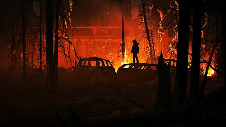 As the image is based at night time there inst a major light source such as the sun, but there is the light from a fire. The light from the fire would work completely different as its placed on the ground, creating a limited amount of shadows. This happens because the light it not bright nor powerful enough to reach long distances, as it you would soon fade away the further it got. Because the light source is a fire this does mean there would be a warm, vibrant mist around it as there isn’t another light source to compete.
 This image includes tones of light and shadows as the source is from outside peaking through the architecture. Because the architecture includes pillars, and large glass windows this would create vase amounts of light being bounced around and reflected of the different angles. The shadows would only appear if the light cant get to it, this is why the sides of the pillars and other objects facing away from the light source are much darker compared to the areas that the sun can see.
 Looking at the image my eyes straight away got drawn to the castle as it was the brightest element on the canvas. You have a darker foreground that includes the character creating the contrast of dark’s against lights. As the foreground is dark this suggests the character is further up than the lower land, being shadowed by a mountain or some near forest. The lighting and vegetation indicates that it would be a warm summers day with the use of light greens.
 I feel that the main vocal point is the village as that’s where my eye gets drawn too. The artist has done this by including a red fog/mist in the heart of the village to attract the viewers eye. Another technique the artist has included is the use of shadows from the stairs at the front, they are fading to the vanishing point, which is the village. You can see this technique even being used for the branch as well as the tip of the building in the right foreground. The dark, muted colours in the image have been used to set the tone of a cold misty night.With the amount of light glazing from the sky this could also infer that its a full moon. Looking at this image it makes me think that somethings bad about to happen or its a big night of celebration of some sort, it tells a story.


![IMG_E1659[1]](https://tobymoore.home.blog/wp-content/uploads/2018/11/img_e16591.jpg?w=1100)
![IMG_1660[1]](https://tobymoore.home.blog/wp-content/uploads/2018/11/img_16601.jpg?w=1100)